How this feature connects to others
Builds on
Feeds into
Feature overview
What visual assets are
Visual assets are the visual components of your brand identity: a logo, a color palette, and a general visual style. Together they form the visual layer of your brand — the things people see before they read a single word about you.
These assets will appear on your website, in your pitch deck, in your emails, and in any materials you share with investors, customers, or the press. Consistency across all of these touchpoints is what makes a brand feel coherent and professional.
Why this comes after you have chosen a name
Your logo should come after your startup name is decided, not before. This might seem obvious, but many founders start designing a logo as soon as they have an idea, before a name or clear brand identity exists.
A logo is a visual expression of your brand — its personality, its audience, and its positioning. Without that foundation, logo design becomes aesthetic guesswork. With a clear brand brief, you have specific guidance: the logo should feel this way, appeal to this type of customer, and communicate this quality.
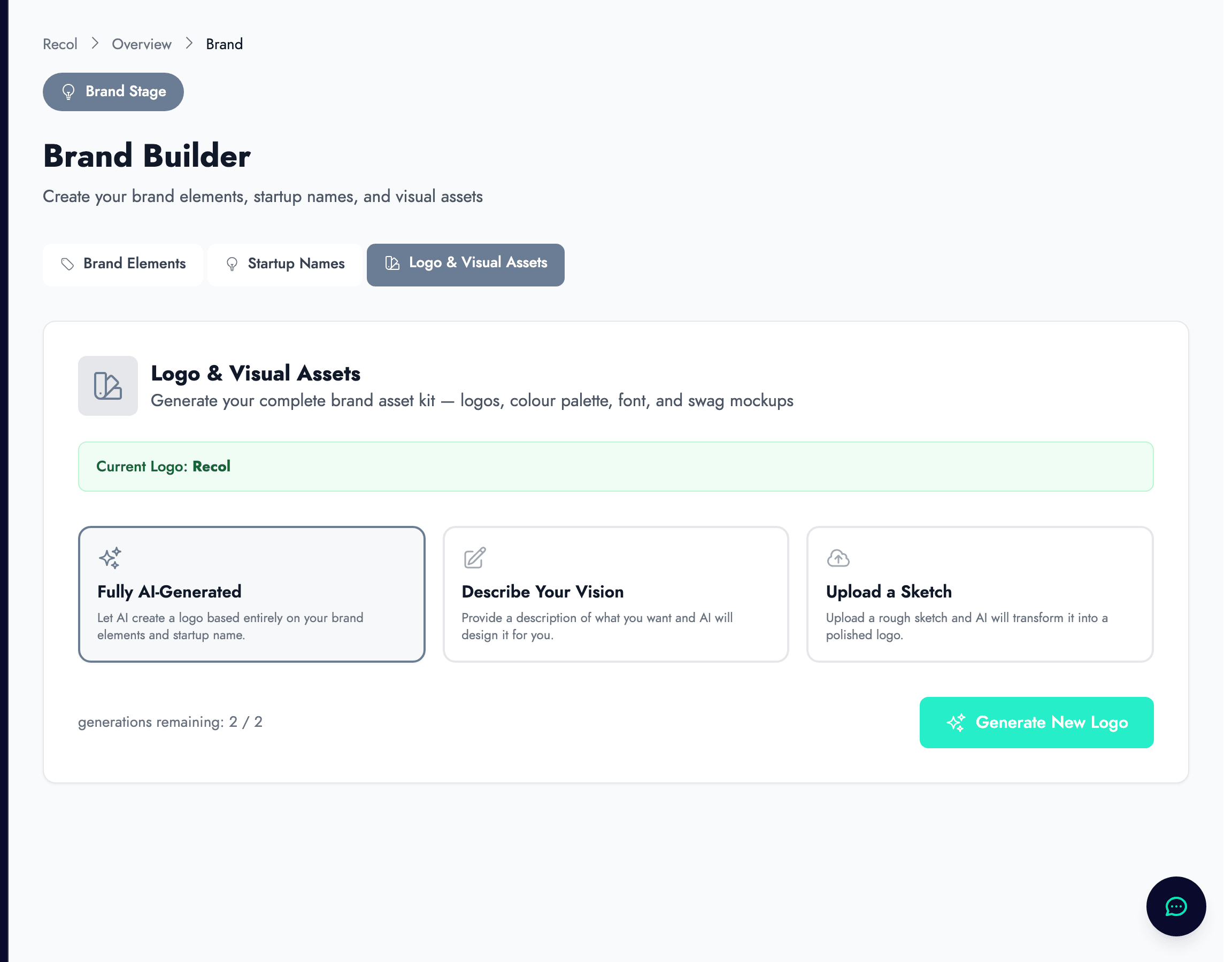
How zigzag generates logos
Zigzag uses your brand elements and chosen startup name to generate logo concepts. You can choose between different generation modes: automatic generation based on your brand description, a guided mode where you specify style preferences such as minimal versus illustrative, and a sketch mode where you can upload a rough sketch for the AI to refine.
Each generation produces multiple options. You can regenerate as many times as you need within your plan's limits. Once you find an option you are happy with, you can download it in the formats needed for your website, pitch deck, and other materials.
What makes a good logo at the early stage
At the early stage, simplicity is more important than artistry. A simple logo works at small sizes — favicons, business cards, app icons — reproduces cleanly in black and white, and does not require explanation.
Avoid logos that are too literal (a lightbulb for an ideas company is a cliché) or too abstract (a shape that conveys nothing specific about what you do). The best startup logos feel distinctive without being clever for its own sake.
How this connects to your next steps
Once you have a logo, you have the core visual assets you need to build your website and prepare your investor materials. Your landing page will use your logo, color palette, and visual style. Your pitch deck will draw from the same visual identity.
Consistency in visual identity across your website, pitch deck, and any other shared materials is a subtle but real signal to investors and early customers. It suggests that you have thought carefully about how you present your company, and that your materials were not assembled in a rush.